Intellian Re-branding project
A global brand renewal project redefining Intellian’s identity as a leader in satellite communications technology.
Intellian is a global provider of satellite communication antennas and connectivity solutions serving maritime, enterprise, and government markets.
The rebranding strategy was led by the marketing team in collaboration with Superunion (UK), with the goal of positioning Intellian as an advanced and future-oriented technology company.
Client Intellian
Creative Direction Superunion (UK)
Role Senior Graphic Designer (In-house)
Worked as the sole in-house designer responsible for implementing the new brand identity across the company’s marketing materials, including datasheets, brochures, packaging, presentations, and corporate collateral.
Collaborated with the global marketing team and Superunion (UK) to ensure consistent application of the new brand identity.
Challenge
The previous identity appeared visually heavy and lacked flexibility across digital and marketing platforms.
Brand assets were inconsistent across global teams.
Technical materials required clearer visual hierarchy and improved readability.


Brand Strategy
The renewed identity was built around the concept of Polaris — the North Star.
Polaris symbolizes guidance, precision, and leadership, reflecting Intellian’s ambition to lead the future of satellite communications technology.
The visual language expresses signal direction, connectivity, and technological precision.
Key themes:
The Future
Guiding Star (Polaris)
High Performance & Signal Direction
My Role
Primary designer responsible for implementing the renewed brand identity.
Collaborated with the marketing team and Superunion (UK) to translate brand strategy into design execution.
Applied the visual system across print, digital, and environmental platforms.
Developed scalable templates for marketing and technical documentation.
Ensured consistent application of the brand identity across global marketing materials.
Managed artwork production and vendor coordination for brand applications.
Identity Development
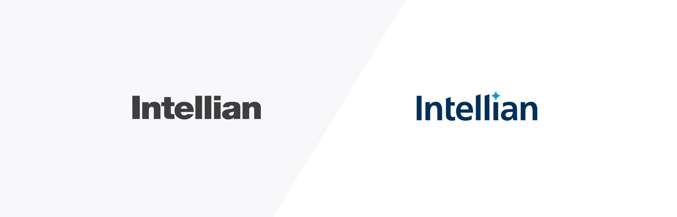
The refreshed identity introduced a more refined and forward-moving visual language.
The diagonal logotype structure conveys momentum and technological progress.
The signature blue reinforces credibility and engineering precision.
Yellow extends the Polaris symbolism, representing energy and optimism.


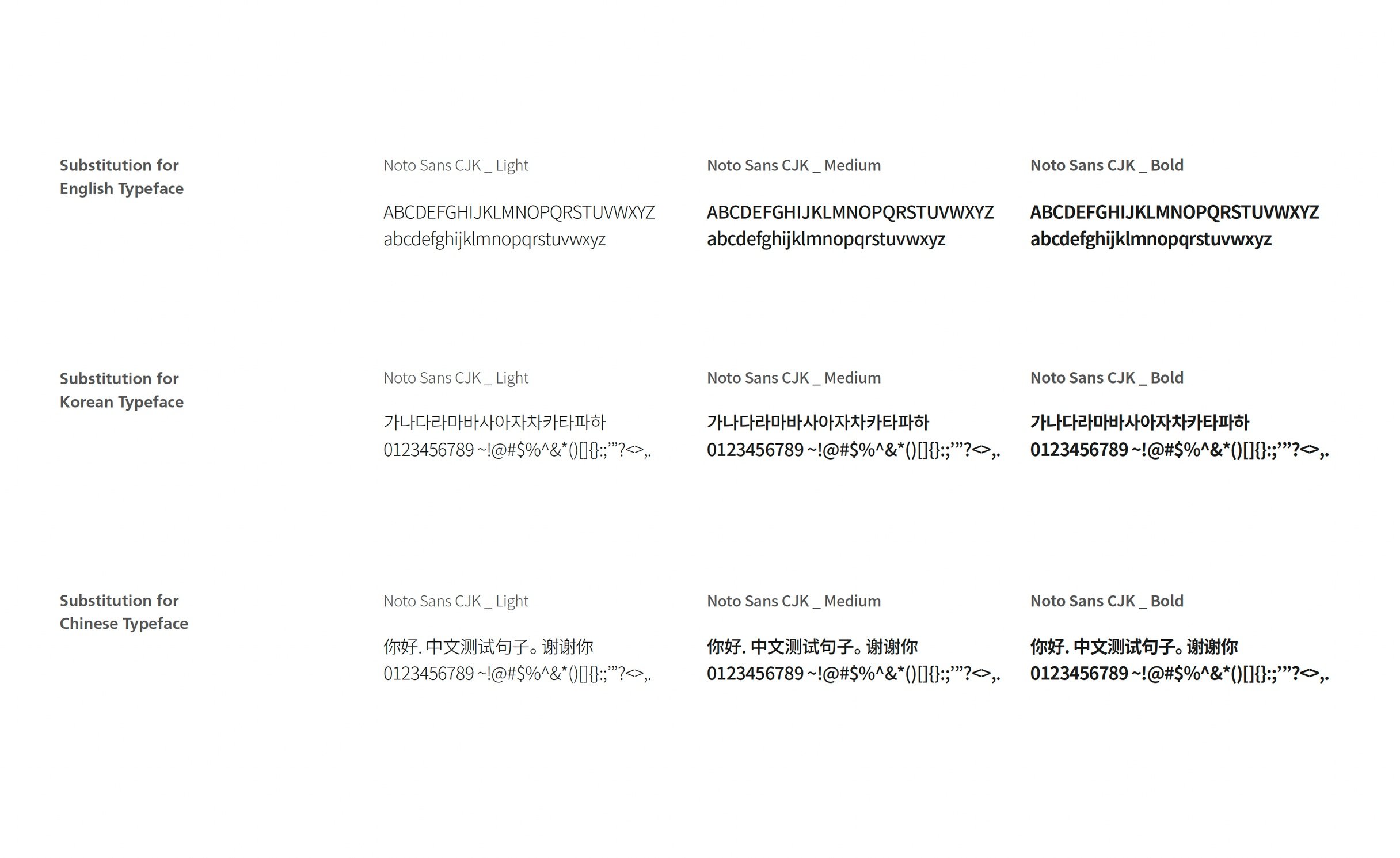
Type face
Modern. Clean. Agile.
Noto Sans CJK was selected to ensure visual clarity and multilingual consistency across English, Korean, and Chinese markets.
The renewed identity was implemented across multiple brand touchpoints to ensure global consistency.
The visual system combines directional graphic elements and a refined color palette to express movement, signal flow, and technological precision.
Applications include:
Corporate marketing materials
Technical documentation
Trade show environments
Digital assets
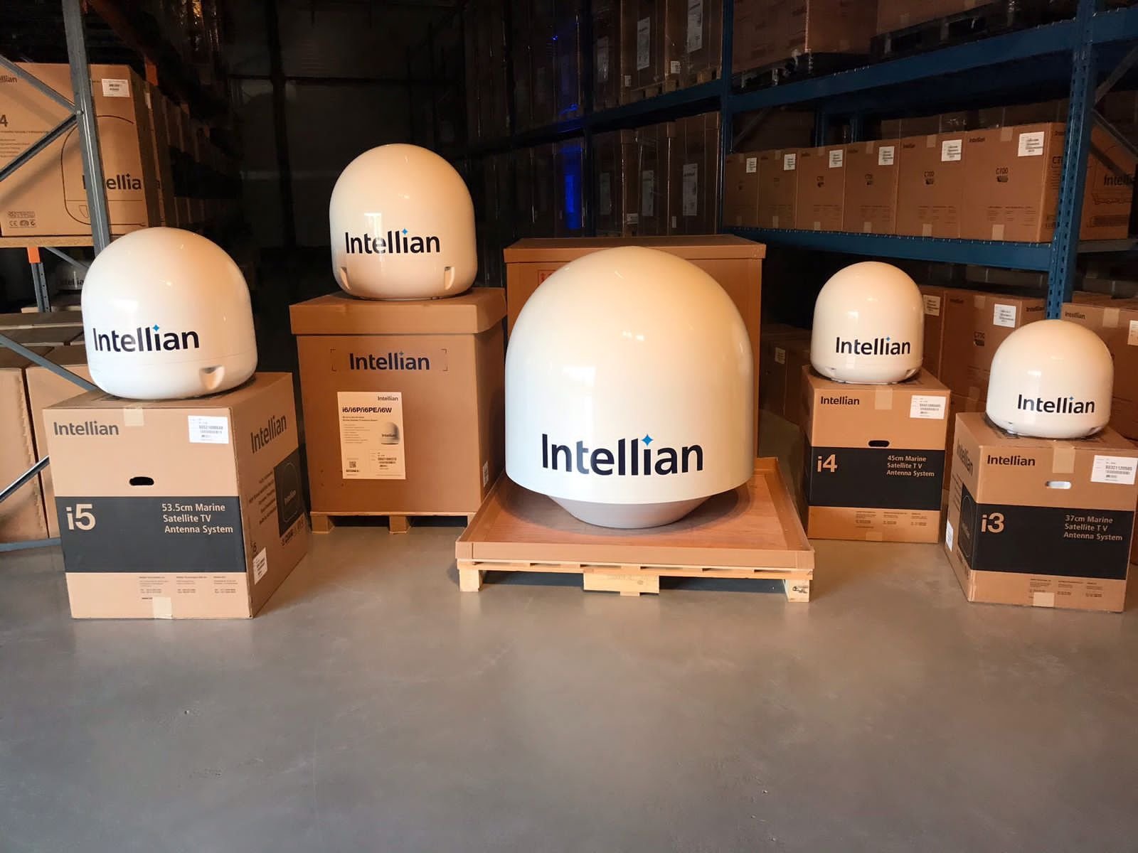
Product packaging
Visual System & Applications


Corporate Materials & Marketing Collateral


Products & Packages


Outcome
The new brand identity was successfully implemented across Intellian’s global marketing communications.
The visual system was applied to a wide range of materials including product marketing assets, corporate communications, and exhibition graphics.
The system provided a scalable framework for marketing, technical documentation, and exhibition environments.
